Chapter 4: Projects section
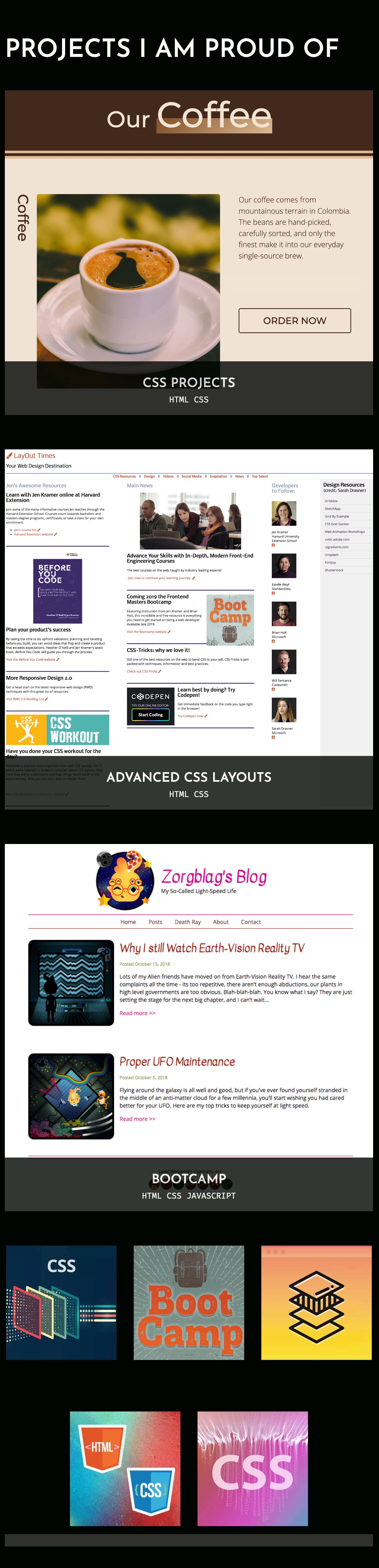
The home page includes a section with thumbnails of various projects you might have completed. This design includes larger thumbnails (perhaps more recent or more important items) as well as smaller icon thumbnails. Your portfolio could use both of these, or perhaps you only need one type of thumbnail.
Fork the opening CodePen to your account:
Beginning CodePenHere are the final looks for this section of the website.
Desktop

Tablet
Mobile

Consider the markup for this section of the website. Describe exactly how you'll achieve this layout. We have 3 big things on top and 5 little things on the bottom. Do we need the same piece of layout to make this, or could we use two different pieces?
4a: Desktop layout
The first thing to consider is markup. Let's focus on the top 3 thumbnails first. What is the relationship between the image and the text underneath? What is the best markup for this?
Once we have the markup in place, we will walk through laying out these elements in the desktop layout, with one large thumbnail on the left and two stacked thumbnails on the right.
We'll then walk through the bottom thumbnails, considering how they will be laid out, marking them up with HTML, and completing the desktop layout.
Ending CodePen4b: Tablet and mobile layouts
Beginning CodePenNow let’s modify the look at tablet and mobile breakpoints. We don’t have to use the same breakpoints as what we’ve used previously. We want to use points that make things look good.
The simplest approach with the top grid is to turn off grid and make it display block. This will stack all figures on top of each other with no space in between. Add a bit of margin and you’re all set.
The bottom grid will need a little more work. We’ll move from grid to Flexbox to achieve the 3 on top, 2 on the bottom centered layout. We’ll need to assign a width for each item (which is flex-basis in Flexbox), and we’ll need to adjust the images so they’re all the same size. We'll stack these on top of each other at mobile dimensions.
Ending CodePen