Chapter 3: Navigation and Footer
Beautiful CSS always starts with great HTML markup... still! In this chapter, we'll mark up a navbar correctly and make it display horizontally. Next, we'll give ourselves a logo and an icon and make sure those icons are accessible. We'll add a "call to action" button for our resume. And finally, of course, we'll make it all responsive, including a hamburger button that runs with only CSS and is fully accessible.
Fork the opening CodePen to your account:
Beginning CodePen3a: Navigation - desktop only
Take a few minutes and pull up links to as many of these items as you wish:
- Github
- Your online resume (Drive, Dropbox, etc - make sure it's publicly accessible)
- For projects, about, and contact, you may link to index.html#projects, about.html, and index.html#contact.
- Add your name to the text on the page. Your name links to the home page, index.html.
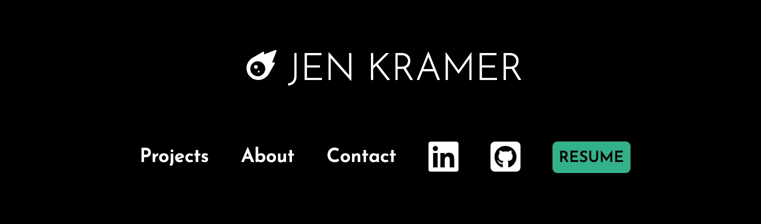
- Semantically mark up the navbar using elements like header, nav, ul, li, and a.
- You can get the icons for LinkedIn and Github at FontAwesome. Copy the SVG versions of the icons.
Once the markup is set, we will style the navbar for desktop only. Don't be too bothered by the navbar smashed up against the edges of the window. We'll address it later. The final version will look something like this:
 Ending CodePen
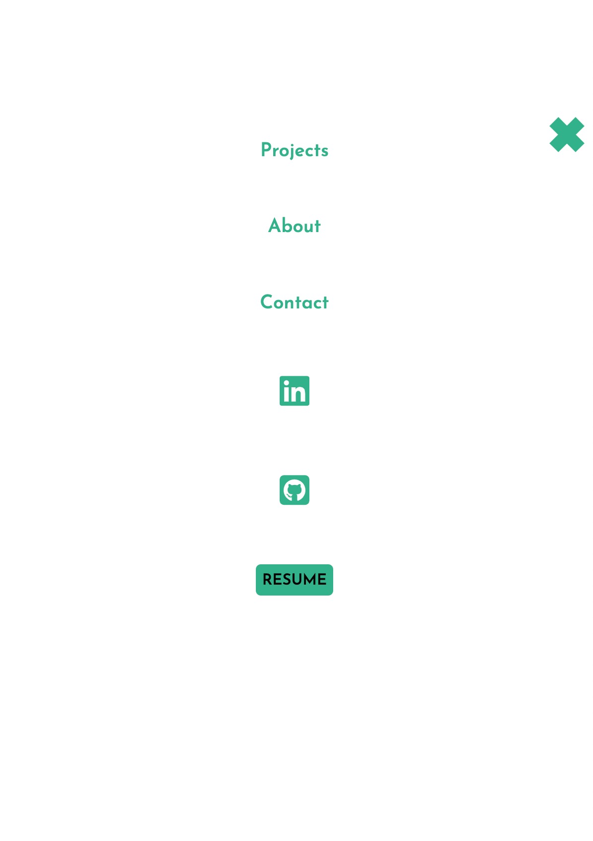
3b: Tablet and mobile navigation
Using max-width media queries, we will create layouts for tablet and mobile dimensions. We'll also include a hamburger button that works with CSS only, based on this article's approach.
Use the CodePen below if you're jumping in, or continue with the pen you were using with the desktop layout.
Beginning CodePenWhen you are finished, the tablet layout will look like this:
Mobile will have two looks, closed (black) and open (white):

Ending CodePen
3c: You try it: Building the footer
Now that you know how to add accessible icons to your page, you try building the footer.
Fork the opening CodePen to your account:
Beginning CodePenHere are the recommended steps to follow:
1. Modify the text above to reflect your own name and title. Gather SVG icons from FontAwesome or other sources to represent the links you'd like to show.
2. Add the SVG icons and links to the markup. Make sure the SVG links are accessible! (See the navigation chapter for details.)
3. Add the background image: https://assets.codepen.io/296057/fem-stars.jpg
Modify the styling so that the text is readable and looks good.
4. Double check the display on mobile, and add any media queries needed to make this look good.
When you are finished, the tablet layout will look like this:
 Ending CodePen